In a growing start-up demands come from everywhere. Every thing you pursue is the result of a choice not to pursue something else, there's that much work to be done and all of it is important. It's hard to pause, look at things that are working, and see if they can be better, there's no time. These are the things that you trust are already good. Yet, a pattern had started to emerge at Mavenlink in our voice of the customer calls and client check-ins; while we were good at key functionality, there were gaps and inconsistencies that could be fixed. We were moving fast, but we were breaking things. This wasn't the amazing future I thought I was designing. It was a future that could be fraught with problems if we didn't get back to fundamentals and fix things.
So, we did a deep dive, talked to users, outlined our key flows and really dug deep into our key product areas. What we found was encouraging. We had problems, but we could fix them. Research revealed that users had high motivation, but had a hard time figuring out how to use the product. Users had table stakes expectations that weren't being fulfilled and we needed to build additional trust with them. We needed to do both the innovative and inspiring new things and get into the weeds where customers were everyday. The potential to make an impact existed in both places.
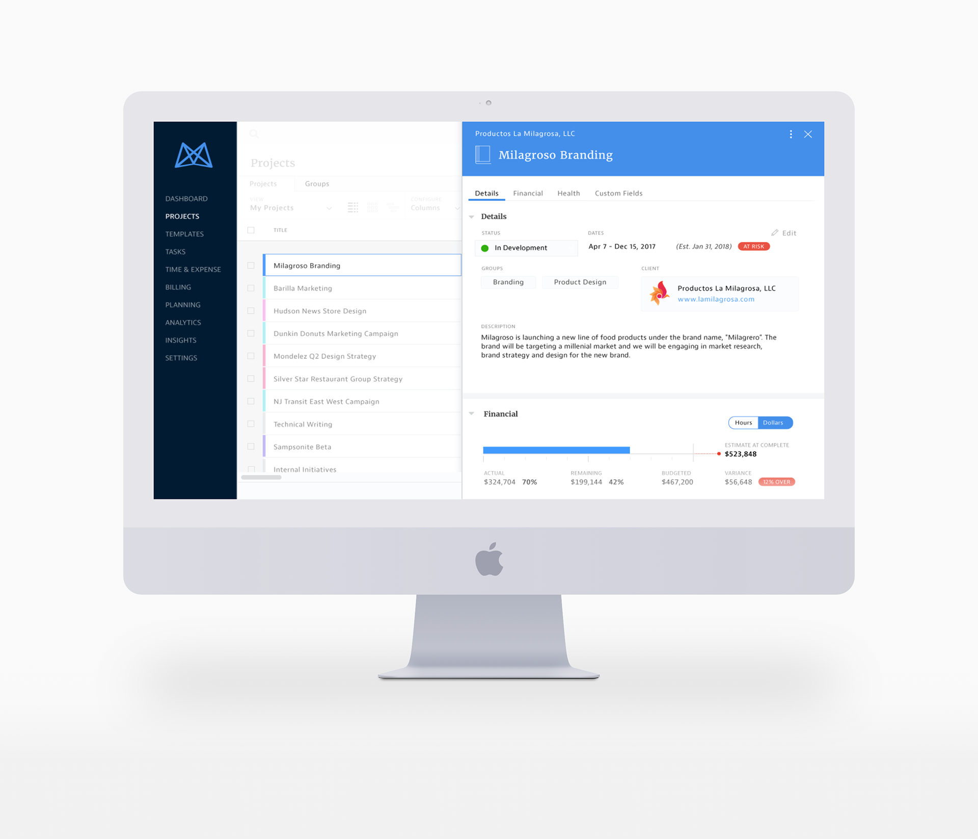
Project Pulse was born of this potential. Project Pulse, was an initiative to make it easier for project managers to understand project health. It was table-stakes functionality that project managers felt was lacking in the product and prevented them from doing their jobs well. Mavenlink has extensive reporting functionality that provided excellent project status reports, but they were not part of the project manager's workflow.
“ It feels like running a marathon just to see one report.”
Project Manager, Technology Company
By bringing the project status into the workflow, we wanted to encourage PMs to use Mavenlink exclusively for project management. There were still parts of the workflow where they moved to other tools or spreadsheets. Getting them to adopt Mavenlink for status meant understanding their needs and why they looked to other tools. We also needed to answer a question: What defines project status across industries and project management styles?
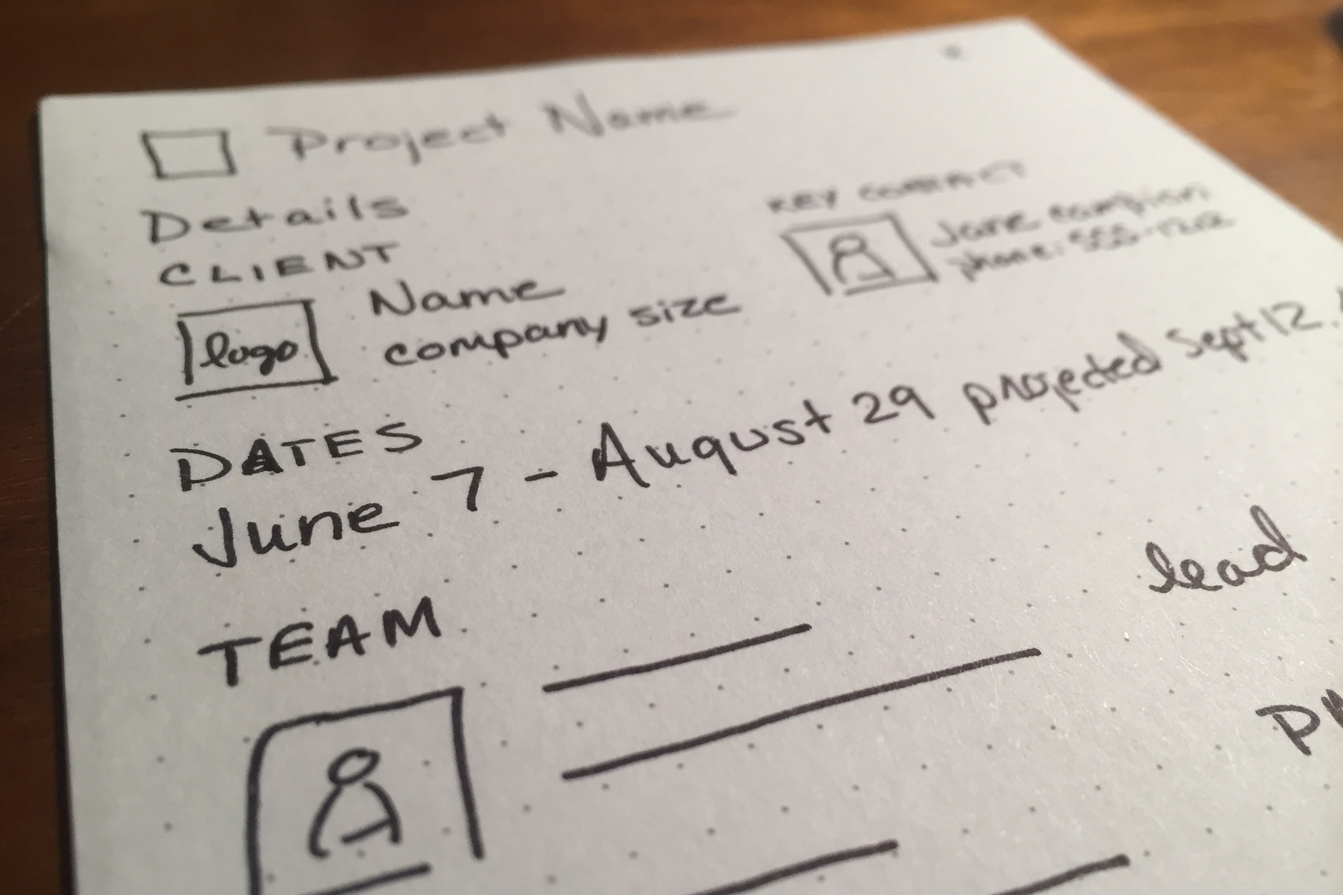
I conducted research with project managers from different industries. Having them describe to me what status meant, what a tool needed to have to be both trustworthy and effective. I went into thinking that we could probably use a mix of task status and estimates to automatically calculate project status, but learned that things were more nuanced and required more interpretation. Computers could make suggestions, but the project manager needed to add the voice over and give context on why a project had gone in a particular direction. I also expected there to be more variance across industries, and that PMP (project management professional) certified managers would have different needs than those in agile environments, but I found more commonalities than not. There were a few key areas that if cleanly aggregated in a single place would provide a lot of value to a large proportion of project managers:
General project information: including client name and schedule
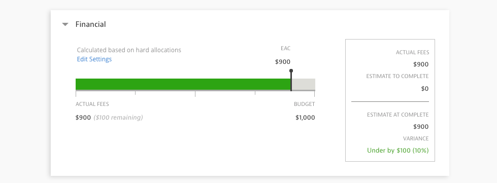
Financials: budget and estimate at complete
Project health: is the project on track or not.
I looked a number of different ways to surface this data analyzing the different flows that project managers go through as they run a project. I ultimately decided that the the project health report would work most effectively as a side panel that would be easily accessible from within a number of different workflows and screens on the site. We wanted to turn the marathon into a seamless segment along the path of running a project.
Since a user could open the panel from a number of different places, it was critical to surface general project information at the top of the panel to provide context. In addition, a simple top to bottom reading experience along a single scan line was the optimal layout for information consumption.
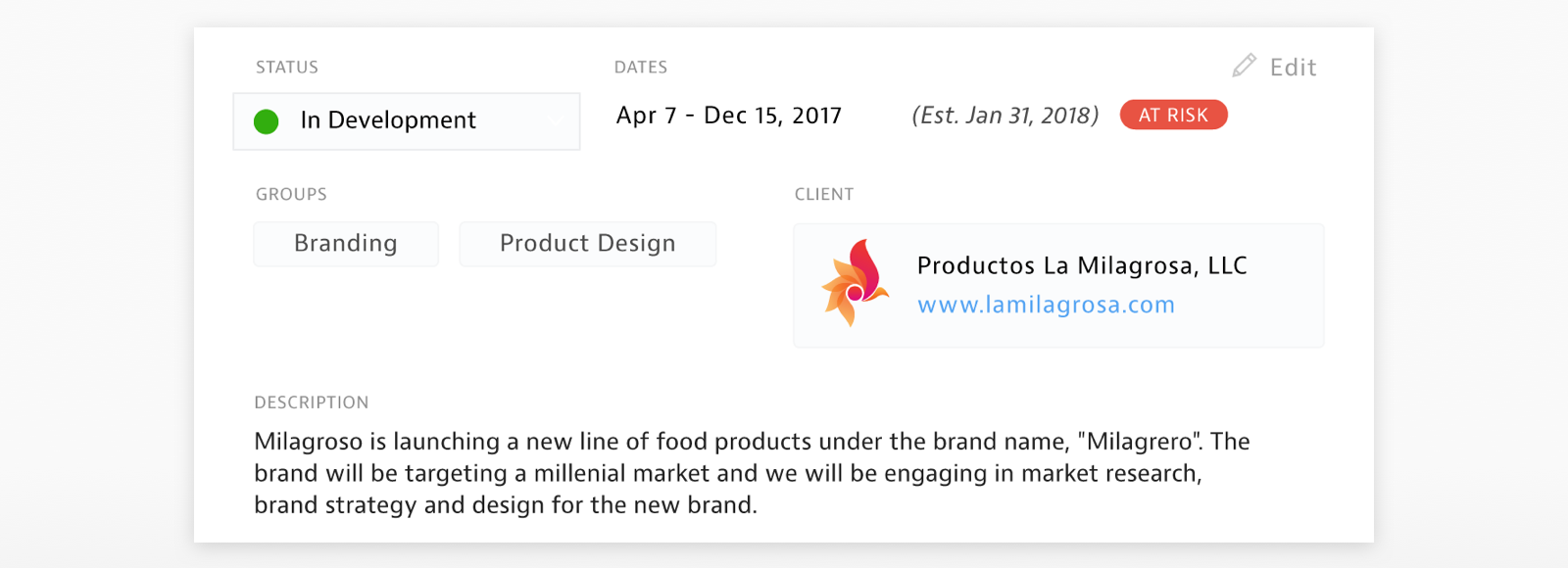
The single most important piece of data for project managers wanted to see was estimate at complete. As a project is progressing the project manager is constantly assessing if it is on track. This includes answering the question are we on budget and how much will it cost in the end? The project manager wanted a quick overview that she could consume with a glance, not a bunch of complicated numbers. We designed a simple bar chart that would progress along a line toward the budget over time. We tested a number of different charts, this was the easiest to consume and understand quickly. Project managers were very adept at understanding where the bar should be if things were going right. If it looked off, she could drill into the tasks and get more context.
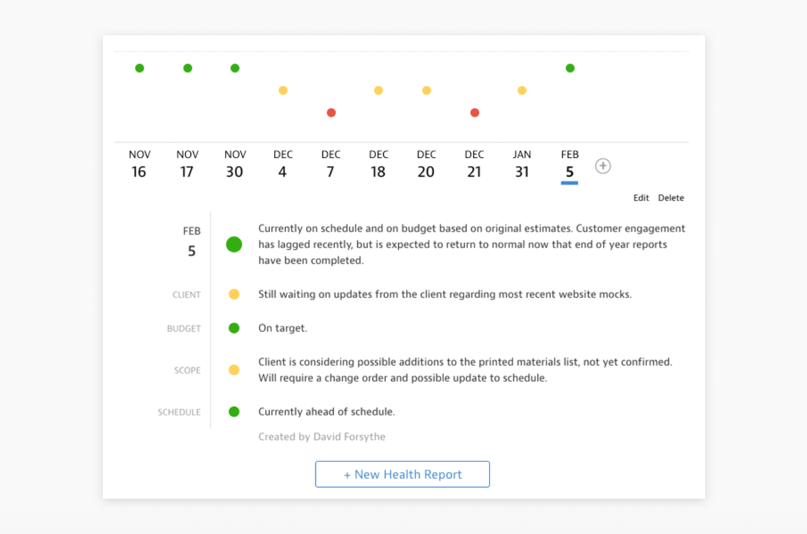
Finally, there is a standard in project management that assesses projects using stop light indicators:green, yellow or red. The project is either on track, showing some warning signs, or experiencing problems that need to be raised. Most project managers we talked to assessed these green, yellow, red statuses on a number of different parameters: client, budget, scope and schedule. We provided project managers the ability to snapshot a point in time and record project health at that time. They could record health status and notes for client, budget, scope and schedule and an overall project status. The overall status was then mapped on a timeline so that project managers and executives could quickly see trends over time. Clicking on any point in time displayed the notes from that date. The historical trend line and ability to easily navigate through status reports was a big hit in testing. It made it much easier for a project manager to answer questions without having to dig in different places for information.
We had a lot of ideas about how we could use AI to proactively notify project managers when a project was trending in the wrong direction or how we could integrate resource management into status, but decided to scope the project to the high value items that we could launch in the shortest amount of time. The quicker you can get a product into the hands of users the better. User testing functionality like this only reveals part of the picture, how an interaction pattern works in an hour of testing is very different than how it feels when you do a task over and over for a long stretch of time. I left Mavenlink before we had long term numbers on effectiveness, but all of our initial results looked great.
Overall this project proved that strong fundamentals can be just as important as new functionality. We were able to provide tangible benefit and an uptick in user satisfaction for our strongest advocates and key promoters in the user base. It also was a great opportunity to work directly with users, work hand in hand with product managers and collaborate with engineers to build something we knew would have both immediate impact and lasting value.