From high school, to college, professional sports, personal training and CrossFit gyms across the country, coaches are working with players of all ages and skills to help them grow both mentally and physically. Quite often, the measure of a player’s progress is observational, inaccurate and filled with bias. Star players can sometimes get undue attention and focus, where other players with the right training and attention could see greater benefit and progress.
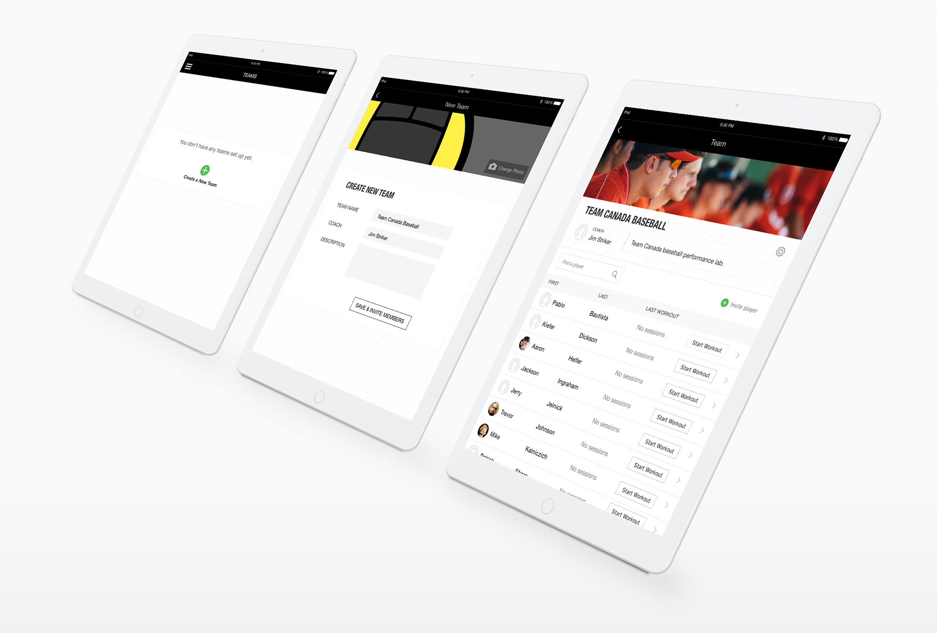
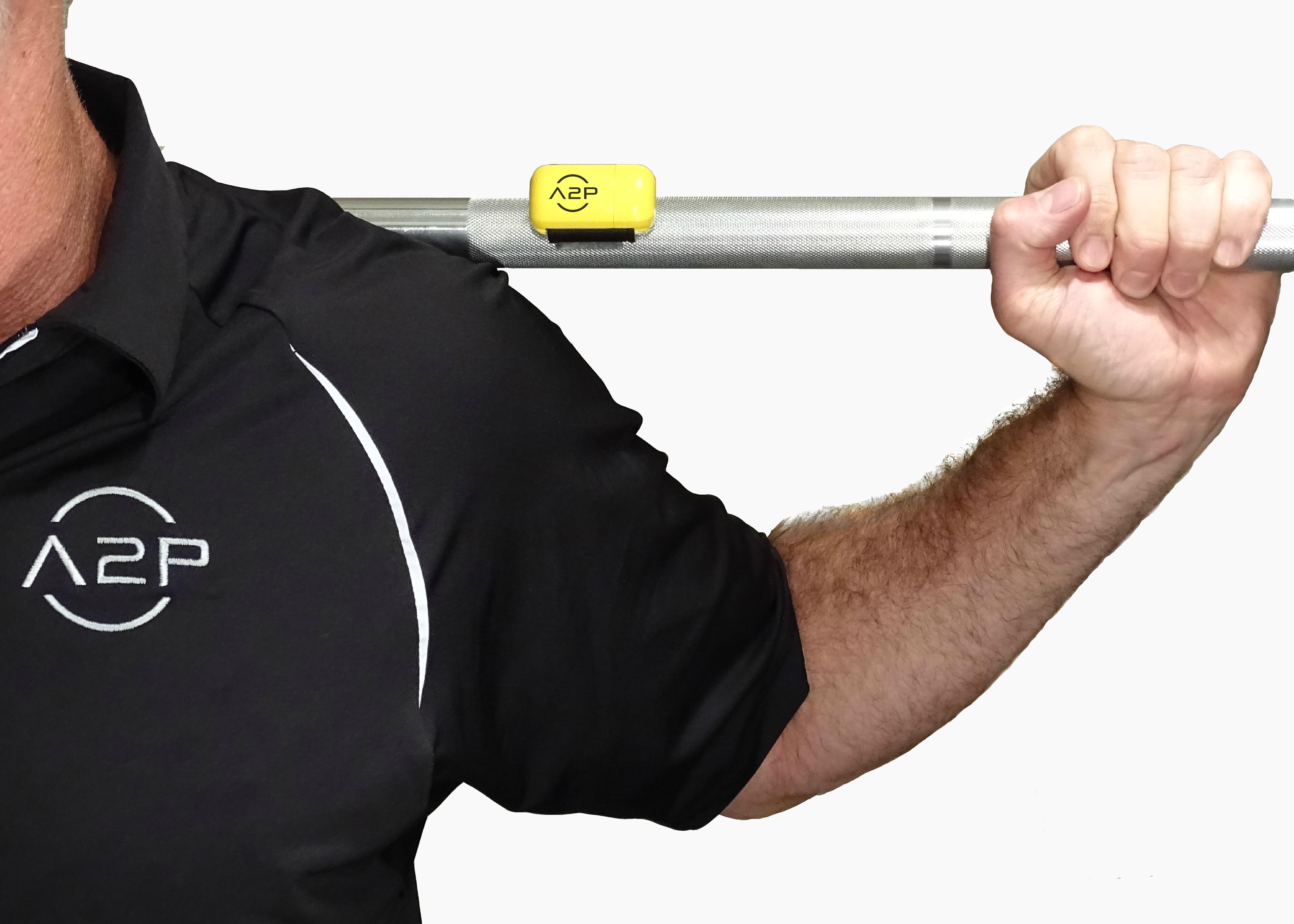
The A2P fitness application coupled with the smart sports devices allows coaches to create personalized fitness plans, track and measure progress for players and see aggregate results for teams. Coaches and trainers are busy, many are avid athletes and often work another job in addition to being a coach. The goal of this project was to create an interface that was easy for coaches to set-up and manage teams, pair devices, and see team progress.
Set-up and management was a key focus. The initial release of the product revealed some interest in the functionality, but users were hesitant to adopt the tool. It was too complicated to set-up and they were used to the tools and processes they had been using for years. We approached solving this in several phases.
“ I don’t have time for this”
– Coach, high school basketball team
First, the co-founders put the product in the hands of the target audience. They wanted to observe first-hand what happened when they got people over the initial hump and the data started flowing. When coaches had the data in their hands and the tools were part of their routine, they were addicted. They stopped seeing the product as a replacement for their expertise and started seeing it as a differentiator. They were better coaches with the tool than without it. The tricky part was, if the coaches didn’t set up their teams initially, and just started using the devices, setting up the team ad-hoc as they went along, they’d never get it set-up in an effective way. The greatest chance of success came when a team had been fully set up from the beginning and in the gym the coach just had to associate a player with a device and they were off and running.
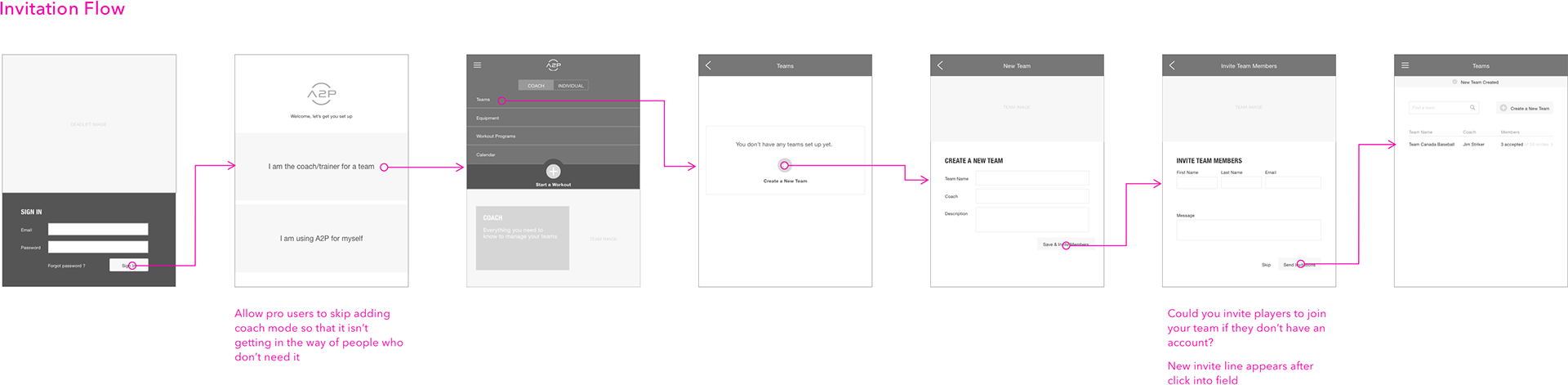
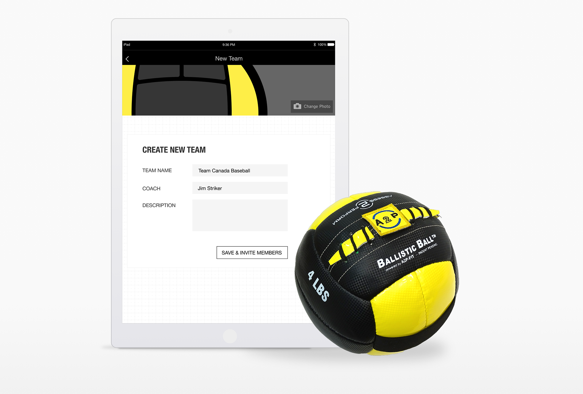
So, step two was to make it dead simple to set up the entire team at the beginning. We minimized the interface to only the essentials. We minimized the initial screens to simple grids and clear calls to action. We tied the invite list to a roster screen the coach would use later to sign people in, so that they associated the process with a high value operation. We first eliminated steps in the process, but found that users preferred more steps that gave them the feeling that things were happening rather than a single step. Initial prototype testing showed that the interface and flow changes made a significant impact on what users felt about the product and their likelihood to use it.
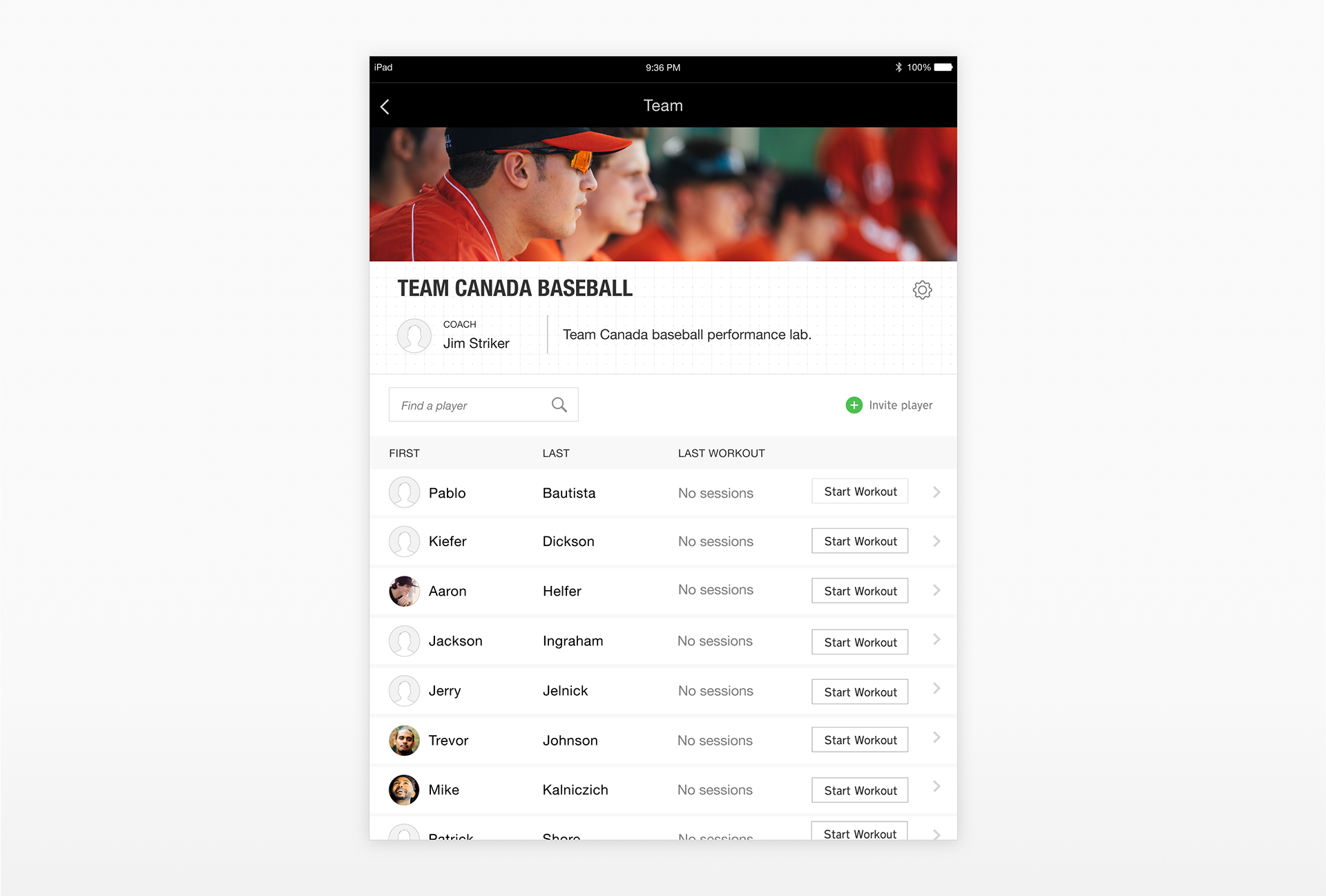
Once we had the flow nailed. We needed to make associating the workout with a player incredibly easy and foolproof. If the coach were to forget to log out the last player and another walked up the data would get associated with the initially logged in player making both player’s data unusable. So, we put a couple of safety checks in the design, one that timed out the session after a few minutes of inactivity, creating a simple re-up flow that prompted the coach to choose the player again. We had to carefully design this screen to ensure that we kept the data integrity without annoying the user. The other safety check was to put a player selection at the beginning of every training program. If coaches didn’t personalize every training program, they would need a way to associate a program they set up with a player. The long term goal of the product was to be able to share data collected from multiple coaches to create a comprehensive profile of an athlete so it needed to be designed with this in mind.
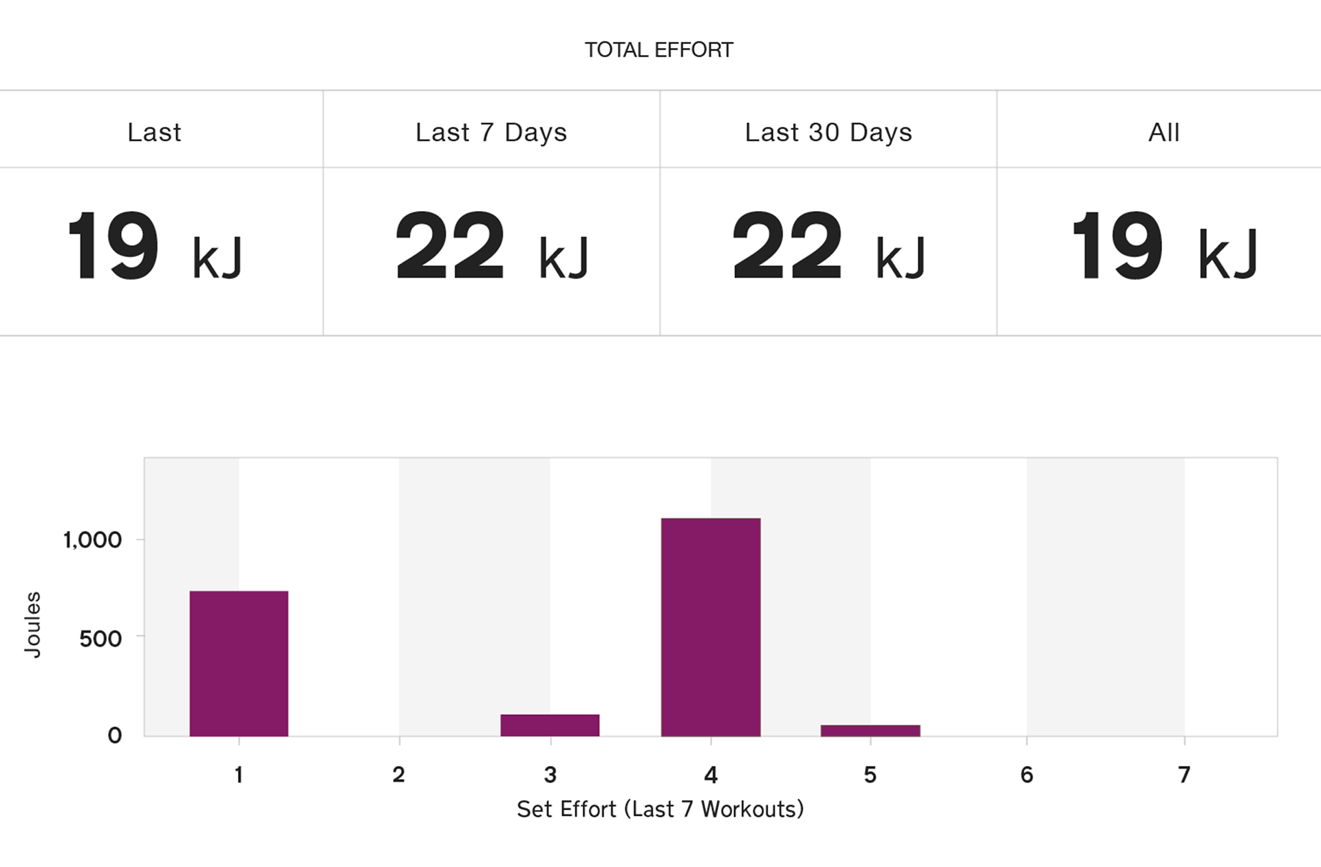
In addition to key insights we found as part of designing the coach mode for A2P (my main role), we made several other unexpected discoveries. First, it’s incredibly hard to read an iPad in direct sunlight. We had to optimize the design for better readability on any kind of device in glaring sunlight. We also learned to design from 3 feet away. If you couldn’t back up and read the text at 3 ft., it wasn’t going to work. In addition to implementing several type-size optimizations in the main app, we switched the typeface to Transport, created to be legible on road signs in the UK, for better readability. This change made a huge impact on the overall product usability, users no longer had to stop mid workout to see if the product was working.
We continue to make better and better tools that push our minds and now our bodies in to new realms. The future of sport performance will take us to new heights. It’s incredibly exciting to work on products such as this that are changing the future one pixel at a time.