THE PROBLEM
As a six year old growing product, the navigation that was carefully envisioned for a smaller product had become disjointed and inconsistent. The goal was to standardize the navigation to remove inconsistencies and minimize the different navigation strategies. Then, through a series of iterations, user research and testing, we would extend the navigation strategy to best meet user expectations and needs as well as our product growth plans. Finally, we wanted to enhance the custom branding in the application, allowing customers to more deeply customize the application and increase stickiness.
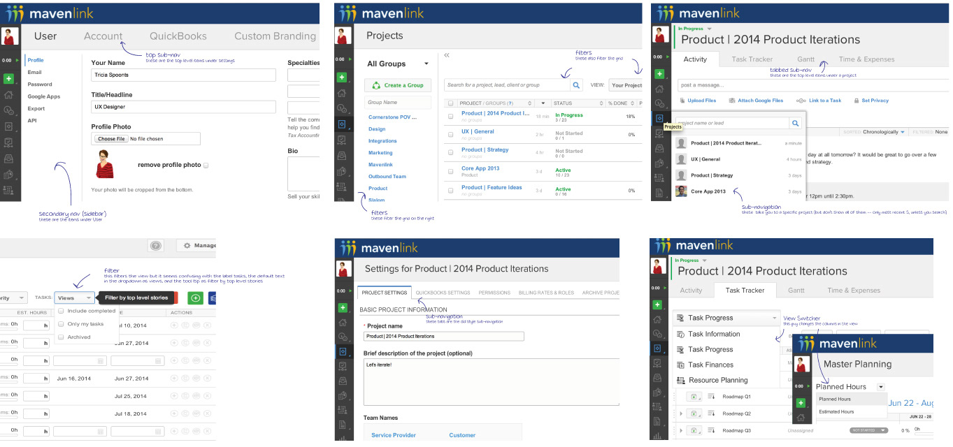
Looking at inconsistencies in the existing navigation
MAKING A SYSTEM
We first identified all of the different ways that users could currently navigate through the application. We then standardized to a single nav/sub-nav system. We put application navigation into the left nav and user specific actions into the top navigation, following some pretty common patterns found in web applications. We removed the iconography from the navigation as testing showed that the icons were not easily representative of the actions. We knew that this change would cause some pushback from our long time users, but felt it necessary to consolidate, allow users to get used to the new navigational structure and then expand upon the new concepts.
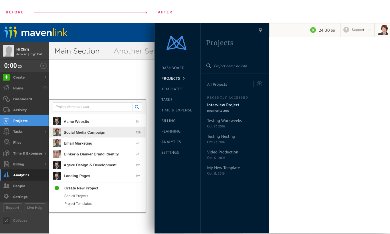
Before and after, rebrand and navigation restructuring
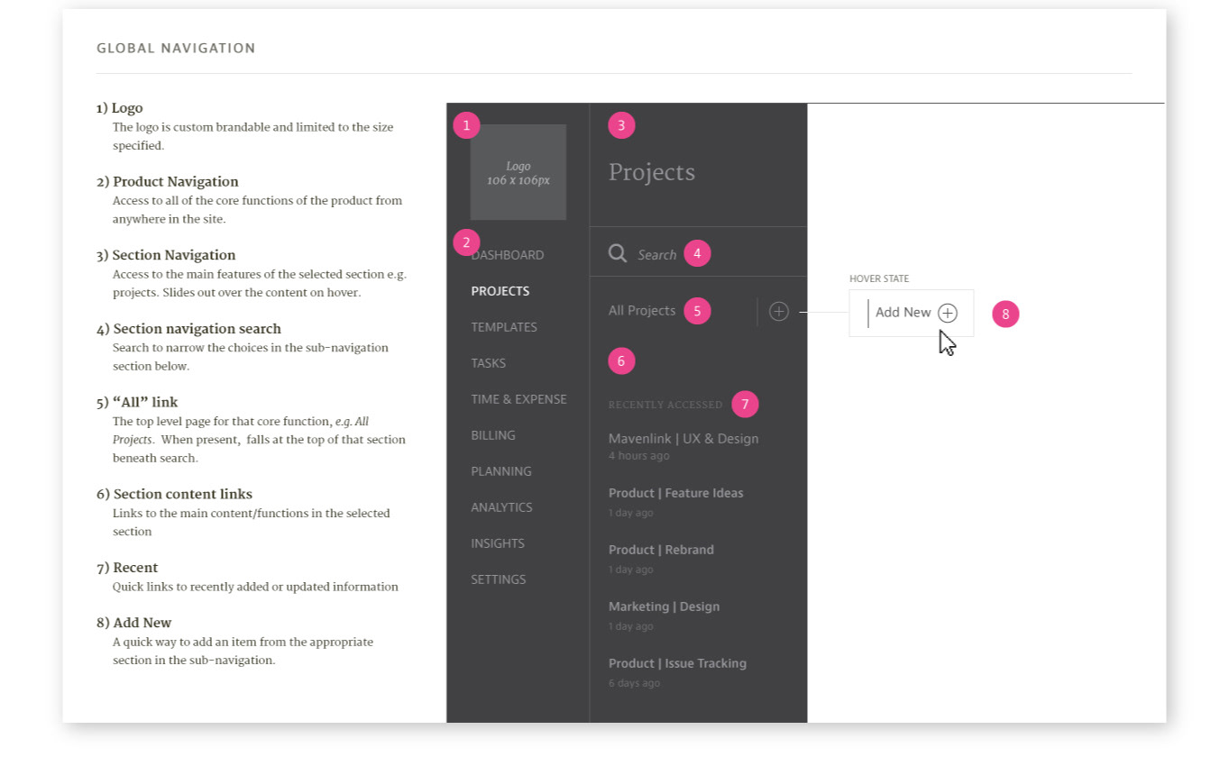
Initial navigation pattern
The Results
We made a mistake on our initial launch by moving the support link to a more hidden location. There was definitely some hesitation amongst the team about moving it, but our testing showed that the new location was findable. It also neatly fit the pattern. So, we proceeded with putting it in the sub-nav. It's one of those things that should have gone against my best instincts, but there are times when I get fooled by data and I love the allure of patterns. This mistake only validated that you have to balance both intuition and data when building a complex product. The advantage to our constant feedback loop, continuous integration and on-demand deploy process is that we were easily able to respond to the feedback and quickly make the link more discoverable by putting it in the top navigation.
Despite the misstep, the new brand and navigational structure have widespread appeal. On the sales side we receive continual positive feedback on the professionalism of the product and close bigger deals. We see fewer struggles in user testing amongst people familiar with the system as they move from section to section. Having a pattern in place we are able to more easily add a new feature and place it in the navigation. We have ongoing and continuous iteration to improve both functional and usability concerns.
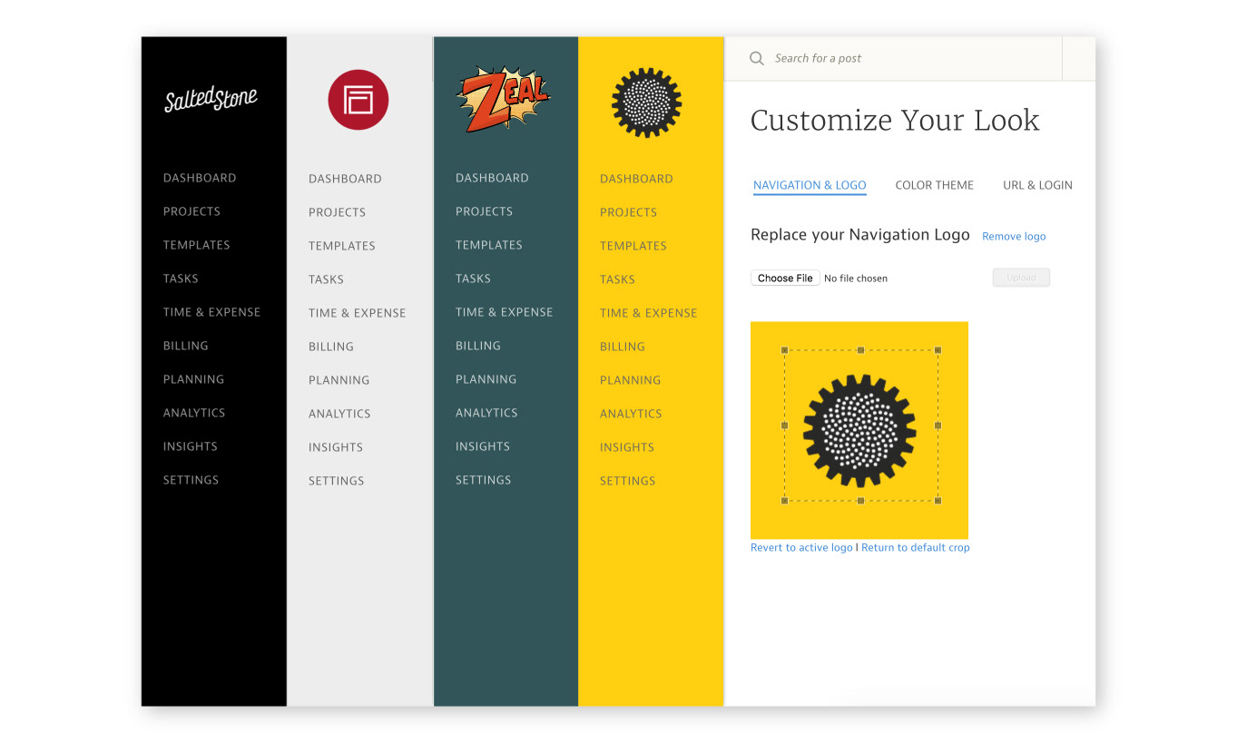
Custom branding in Mavenlink
Next Steps
We've now grown past the initial eight top level items that were in our navigation (for users with the top level of permissions) and need a grouping strategy to aid in scanning. We also know that a large number of our collaborators only move within one project and at the top level only use task management and time and expense functionality. So, we'd like to experiment with navigation strategies that will aid this user type in more quickly moving through their workflow. We are also looking at alternatives to the hover interaction, solutions to the obscuring of page content that happens from that hover, enhancing discoverability of hidden sections, and first time user experience with our navigation. There's still a lot to do, but it is a fun and rewarding process.

