
Pattern ANALYSIS
Designing intuitive interfaces through study of existing patterns
Graphical user interface (GUI) design is a thoroughly modern pursuit, dating back at its earliest to the late 1960s and early 1970s. Though fifty years seems like ages in Internet time, it’s just a small slice in design history. Take book design, for example, the Table of Contents is credited to Quintus Valerius Soranus in 82 BC, over two millennia ago. You’ll rarely find a book without a table of contents today. Helpful, understandable, patterns persist over time.
Because of the continual advances in technology, it seems like the way we are designing interfaces is constantly changing. As quickly as the hamburger comes the hamburger seems to go, but does it? The first hamburger menu was designed for the Xerox Star workstation in 1980 as a way to access menu commands that would not fit on the screen.
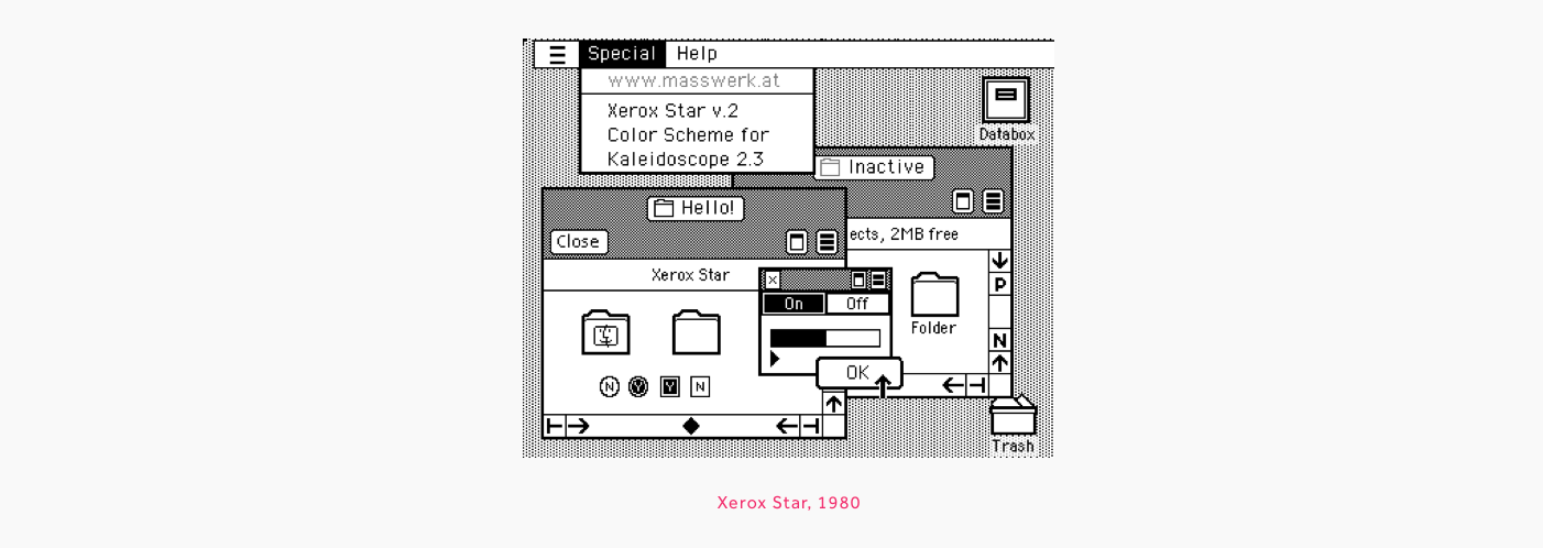
“The hamburger symbol’s longevity, as well as that of many other PARC images, is a testament to its simplicity, utility, learnability, and memorability”
Norm Cox, original designer of the hamburger menu for Xerox PARC
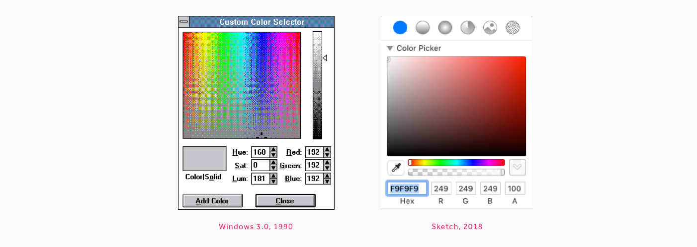
Sound familiar? The underlying needs that we are designing for remain constant. The amount of data we have available on a computer far exceeds our screen space, so we need compact ways to access it. On the desktop we certainly still have files and folders, menus and choosers. Though the UI has evolved, the basic functionality of my Sketch color chooser is remarkable like that in Windows 3.0 released nearly 30 years ago in 1990.
So long as we have similar problems to solve we will continue to cycle through historical solutions, recycling and refining as we go along. Some would say this is a lack of creativity, a shortage of innovation, but so long as a problem continues to exist, the probability that we will cycle back to a previous solution is high.
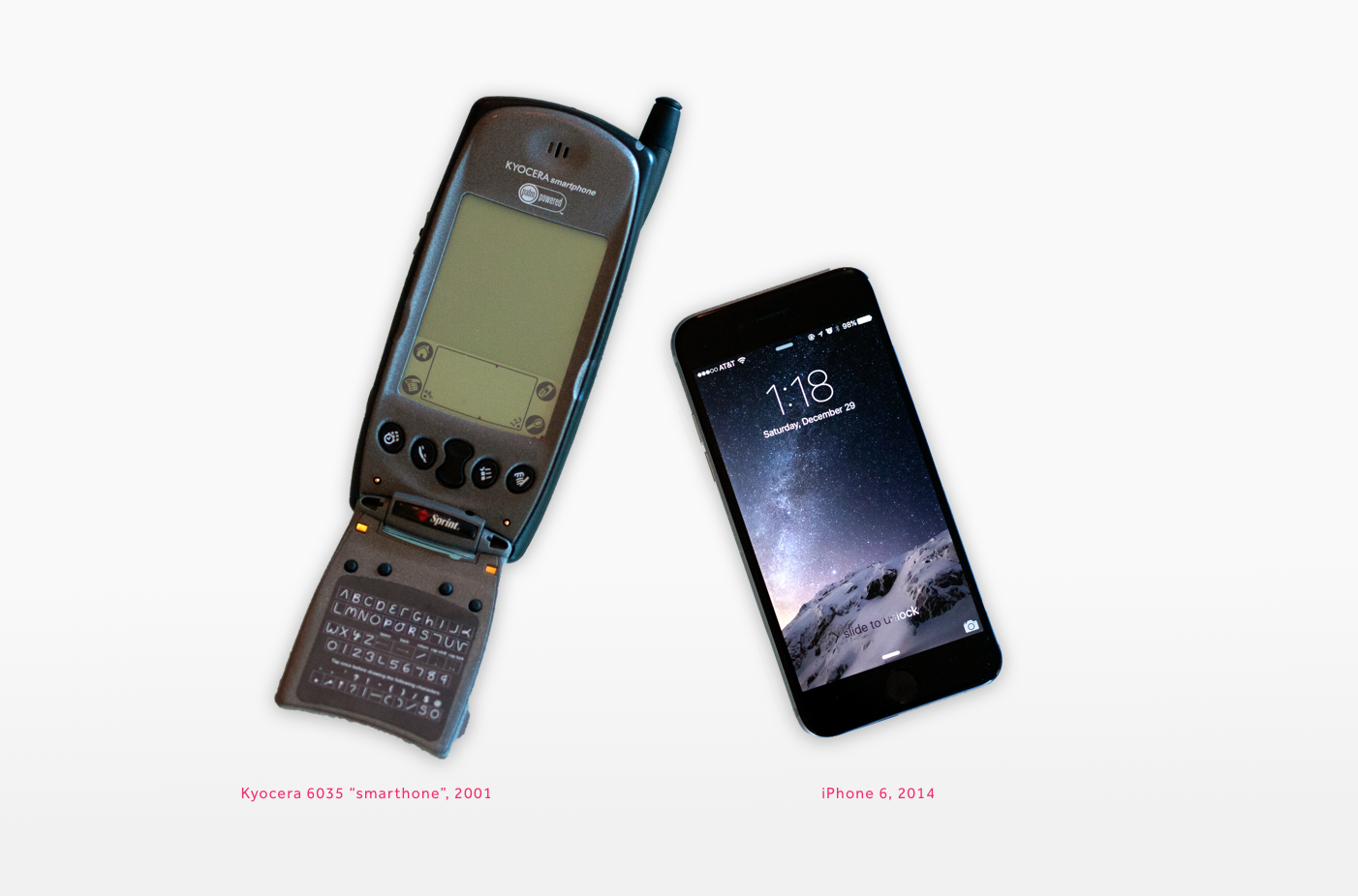
While evolution and innovation are certainly good, I definitely prefer my iPhone to my Kyocera "smartphone", there is an advantage to having common patterns that persist over time. In Thinking Fast and Slow Daniel Kahneman describes intuition as pattern recognition. Our "fast brains" work on intuition and operate "automatically and quickly" with "little or no effort". Kahneman goes on to describe the pitfalls of fast brain thinking in decision making, but as interface designers this ability to quickly recognize patterns is advantageous. When a user can figure out how to use an interface without any cognitive effort, the product feels simple. As long as the solution is one that is understandable and solves the problem, the need for innovation is low. We can save our cognitive effort as designers for the problems that have no good solution or where needs are not being met.
So, how do we identify the things that are working well and those that are ripe for disruption?
First, there are lots of people that have done research in UX and UI patterns, we can look at their designs, read their blogs and their books, listen to their podcasts and talks and take copious notes.
Next, we look at and try lots and lots of products. When trying things out, we can often feel the sense of ease that comes from something that our “fast brain” gets. Write down exactly what you did and why it worked. Was it the visuals, the copy, the organization, the interaction. Change one of those things and see if it still works.
Finally, validate the findings. Just because we “get” something doesn’t mean that others will. You don’t have to build something new to test it. Have people use someone else’s design, see for yourself what is working and what’s not. The larger the sample space, the better the results. Find people who are older, younger, in middle America, in non-technical jobs, see if they get it. If the pattern works, it’s almost always repeatable.
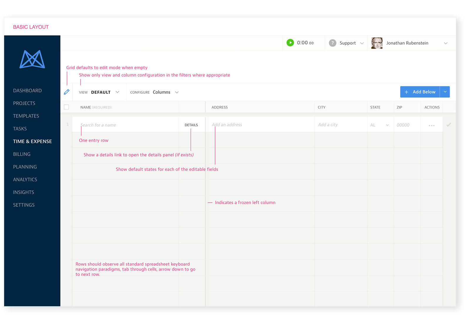
At Mavenlink, we set out to get people off of spreadsheets and in to Mavenlink. The interface had some visual similarities with a spreadsheet, but the commonalities stopped there. We didn’t want to give them what they already had. Yet, this was a constant frustration to users. Because it looked like a spreadsheet, our users expected it to act like a spreadsheet. The navigational patterns in spreadsheets are ones that many business users are intimately familiar with and have muscle memory of what they are. This is a pattern that is worth repeating for the cognitive ease that it will give the user. This is a simple example of repurposing a common pattern, but one that is often missed. We try innovating in the interface when the real power to disrupt is on the edges, the problems the tool solves and the connections it creates.